Advanced Interactive Design - Final Project
19.11.2024 - 24.12.2024 / week 9 - week 14
Velicia Raquel Dewi Setiawan | 0369188 | Bachelor of Design (Honours) in Creative Media
Advanced Interactive Design
JUMPLINK:
1. LECTURE
2. INSTRUCTION
3. Task 3 - Completed Thematic Interactive Website
1. Progress
Loading screen
This one is not too hard. I did have to change the middle white circle to the bottom so the anchor is on the bottom, allowing me to change the shape up and down, while the bottom bar stays in place. Then, it just took spacing in different keyframes and adding a shape tween for it. I also added the fade-in and fade-out for them.
 | |
|
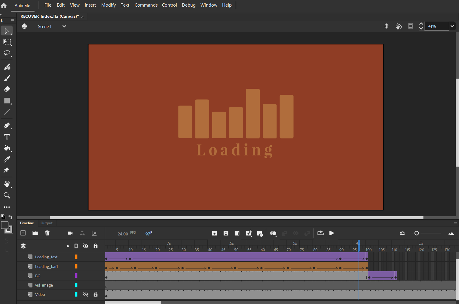 |
| Fig 1.2 Loading Screen Fade Out, Week 13 (17/12/2024) |
Video
The beginning process of the web was, of course, putting the video in first and following the tutorial on YouTube, which worked just fine. But when I added other elements that were supposed to be on top of the video, the video just went through every other layer on top of it. Also, the video wouldn’t start playing by itself, and the user had to click it to start playing. The other way was for it to start playing immediately, but the sound had to be muted, which is disappointing.
Fig 1.3 Vidio Problems, Week 13 (17/12/2024)
I asked sir for advice on how I should handle the video, but still came up short for now.
The mask in Adobe Animate also does not cater to a smoother, softer text transition like the one I made in the Figma prototype. I asked sir, and sir said I could use After Effects to compensate for that limitation. For now, I used an image to replace the video.
So I did make it in After Effects. It required me to look through tutorials on my own from YouTube, but I forgot that the end result is a video, which still goes through every other layer on top of it. So, we’re back to square one.
 |
Fig 1.3 Vidio Problems, Week 13 (18/12/2024) |
Opening
First things first, I tried to make the opening screen for the web. In the prototype, I made a smooth transition. After a lot of experimenting with the tweening, I finally got the text transition I wanted. It’s certainly not as smooth as the one in the Figma prototype, but it looks good enough.
 | |
|
By using the classic tween from the invisible text keyframe and another keyframe with visible text in the proper place—between that and the mask (which sadly can’t be feathered at the edges, so if I don’t make the initial text invisible first, the transition won’t be as smooth)—I got the transition good enough for me.
 |
Fig 1.5 Opening Page, Week 15 (1/1/2025) |
For the ease-in and ease-out tweening, I also spent a lot of time tweaking it to make it as smooth as possible. By making the tweening for the position and color independent, the position uses a variation of ease-out (quick then slow) depending on the text size, and the color uses ease-in (slow then quick). So, the animation of the text coming in and out didn’t look too noticeable with the masks.
 |
Fig 1.6 Tweening, Week 15 (1/1/2025) |
I used a still image of the video as a replacement for the video.
I continued on with making the opening title for the web with the interactive hover button animation. How did I do it? I followed this tutorial on YouTube that allowed me to make animations using tweening by changing the button hover to a movie clip instead of the usual one-frame hover button.
 |
Fig 1.7 Opening Page, Week 15 (1/1/2025) |
 |
| Fig 1.8 Hover Animation, Week 15 (1/1/2025) |
With this, I could make slower and smoother animations instead of an immediate change like the usual. Yay!
Sound
The second hurdle was sound. Sir told me I could do it without a problem, but it turned out I couldn’t even get the MP3 file into my project. The program didn’t give me feedback on what to do and just said, “It can’t import” my file. So, I searched the internet for a solution, and after a while, I found a pretty recent one:
I had to download Audacity and change the project rate to 22050 before exporting it. Then, I could import it to my stage.
 |
| Fig 1.9 Sound, Week 15 (1/1/2025) |
I managed to get the song timeline on the bottom to go with the song, but I couldn’t make it go too far, or the project would crash. It only worked halfway, but eventually, after some help with coding, it worked on its own despite the button going back and forth in the timeline.
 | |
|
For the mute sound button, I tried finding a tutorial on YouTube, but all of them used ActionScript instead of HTML5. When I tried with ActionScript, the preview didn’t show up. So, I ended up using ChatGPT for help, and thankfully, it worked.
 | |
|
Menu
Then, I tackled the web menu. It wasn’t that hard, actually. It just took lots of experimenting. The snapping to the grid was a bit finicky in the program too. When I zoomed in too much, it would lag, but if I didn’t, I couldn’t get precise positioning. I was having trouble with tweening the lines too, as they didn’t work as I wanted them to. |
| Fig 1.12 Menu Page, Week 16 (6/1/2025) |
It was at this point that I realized how many “masks” I would need for this—so many.
After the opening transition was done, I moved on to making the text buttons and making them hover. This is where I got stuck and spent hours on it. I discovered that text alone isn’t suitable for hover animations because only when you hover over the text (and text doesn’t have a big area) does the hover animation activate. My hover animation moves the text to the right.
 | |
|
This caused a glitching motion, as it kept registering that the mouse was over, then not over, the text. Since my web relies on smooth transitions for everything, I redid all the buttons with a background of the same color as the web background. This way, the button wouldn’t glitch out.
 | |
|
Another problem was the line that appeared when hovered with the text. When I tried to make it, it simply wouldn’t appear, and some of the text got clipped at the end. This part was genuinely frustrating and took hours to figure out.
At first, I thought it needed to be on top of the text to appear, but after I added the background and it still wouldn’t appear, I knew it wasn’t that. Then, my friend suggested asking ChatGPT, and one of the solutions ChatGPT gave was “masks.”
It turned out the masks were the problem. I didn’t make them big enough for the hover animation, as I didn’t account for it when I initially made them. So, I redid all the masks to accommodate the hover animation, and all was well. I was extremely glad when I figured it out. Then, I added the links to the appropriate buttons.
I made the closing transition for the menu. In the beginning, I didn’t know I could copy and paste overwrite the frames. I copied every layer of transition frames from the main page. But after a while, I found out, and it made things easier. Then, I just added the stop action after the transition arrived at the main page again.
Artist & Credits Page
For the artist page, I made the transition from the menu immediately to the artist page. Then, for the closing, I made it go straight to the main page. This involved a lot of tweening, masks, and adding stop actions in the appropriate frames. | |
|
The credits page was the same—masks, tweening, stop actions. Again, it wasn’t that hard; it just took a lot of time.
 |
| Fig 1.16 Credits Page, Week 16 (7/1/2025) |
Tracklist
For the tracklist page, it was easy enough once I got the flow of it. It was a bit hard to make the hover animation for it, as I copied the original frame for the hover animation. So, when I changed the color of it, it also changed the original button color. But by breaking up the objects, I could make a new group independent of the original, so it wouldn’t affect it. After that, it was a simple closing transition, and it was done. |
| Fig 1.17 Tracklist Page, Week 16 (8/1/2025) |
Buttons
I’ve already talked about the buttons in the menu page, so this time it’s about the animation of the close button for the artist, credits, and menu. It’s a bit hard to pull off as I can’t make it as smooth as the Figma prototype smart animate. In the end, I did my best by blending the colors, but the lines in the middle just immediately change in the end.
 |
| Fig 1.18 Menu Button Hover, Week 16 (7/1/2025) |
For the main buttons, the first time I made the animation for the hover for most buttons, I realized it was too slow for a hover button. However, even after I changed the timing, sometimes it wouldn’t be faster or wouldn’t show the hover at all. This happened a lot for other buttons and made me worry it wouldn’t work in the final result. In the end, I just redid the movie clip hover for all of them.
 | |
|
 |
| Fig 1.20 Credits Button Hover, Week 16 (7/1/2025) |
 |
| Fig 1.21 Sound Button Hover, Week 16 (7/1/2025) |
For the tracklist button, it was also easy enough with the looping line.
 |
| Fig 1.21 Tracklist Button Hover, Week 16 (7/1/2025) |
One of the mistakes I made late in this was not naming the instance of the button ahead of time. So, when I previewed it, sometimes the button didn’t work, and I had to recheck everything to make sure it worked smoothly.
Final Adjustments
I tried to make the video work with a movie clip, but after it crashed my laptop twice and somehow erased some of my latest saves, I decided not to push it again. (The project was at 2GB and took a total of 1 minute to see the preview. Nope.)Because I had so many incomplete project saves in the folder besides the final project, it wouldn’t upload to Netlify. I had to change the folder and sound path in the project to make it work.
2. Final Submission
| Fig 1.22 Web Showcase, Week 16 (8/1/2025) |
| Fig 1.23 Web Showcase with Links, Week 16 (8/1/2025) |
4. Feedback
Week 13:
Spesific Feedback:- I asked Sir about the video problem, but after trying many ways, it still doesn’t work, and Mr. suggested just recording how the web is supposed to work.
5. Reflection
1. Experience
Working on this project has been a rollercoaster. At first, I struggled a lot, especially when I couldn’t include the video, which was supposed to be the main attraction of the web. It felt a bit sad, but I decided to just try my best with what I had. Figuring out how to make smooth transitions and animations was also a challenge. I spent so much time experimenting with tweening and masking, but eventually, I got a result that I was happy with. It wasn’t as smooth as the Figma prototype, but it was good enough for me. Along the way, there were so many issues like lagging, glitches, and even some file crashes. Honestly, it was frustrating, but I just kept going, searching online for help, and asking friends when I got stuck.
2. Observation
One thing I noticed was how much patience this process required. A lot of the features I wanted, like smooth transitions or hover animations, didn’t work right away. For example, using text as buttons caused all sorts of glitches when the hover animation moved the text. I had to redo all the buttons with invisible backgrounds just to fix it. The snapping-to-grid feature was also pretty finicky—it made positioning really hard, especially when zooming in caused lag. And masks! Oh my goodness, masks were everywhere in this project. I didn’t realize how much I’d rely on them, and of course, every time something didn’t work, it was usually because the mask wasn’t big enough.
3. Findings
This project taught me so much about working around limitations. Masks were my best friend, but they needed constant adjustments to work properly. I also learned that animations like hover effects work much better when using movie clips instead of static frames. For the audio, I had to use Audacity to change the project rate just to get it imported. Even then, I couldn’t push it too far without crashing the project. And oh, naming the buttons and instances properly? I didn’t do it at first, and that came back to bite me later. I had to go back and recheck everything to make sure it worked smoothly. In the end, even though it wasn’t perfect, I’m happy with what I managed to create despite all the challenges.


Comments
Post a Comment