Advanced Interactive Design - Task 2
22.9.2024 - 12.11.2024 / week 5 - week 8
Velicia Raquel Dewi Setiawan | 0369188 | Bachelor of Design (Honours) in Creative Media
Advanced Interactive Design
JUMPLINK:
1. LECTURE
Week 5-6 - F2F (22-29 Oct, 2024)
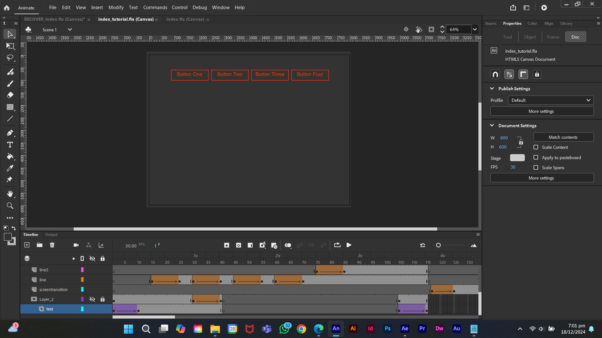
1. Button Animation
 |
| Fig 1.1 Button Animation Progress, Week 5 (22/10/2024) |
Week 7 - F2F (5 Nov, 2024)
1. Screen and Button Animation
 |
| Fig 1.3 Screen and Button Animation Progres, Week 7 (5/11/2024) |
Week 9 - F2F (19 Nov, 2024)
1. Transition Animation
 |
Fig 1.5 Transition Animation Progress, Week 9 (19/11/2024) |
2. Navigation Animation
 |
| Fig 1.7 Navigation Animation Progress, Week 9 (19/11/2024) |
2. INSTRUCTION
3. Task 2 - Interaction Design Planning and Prototype
- Walkthrough Video presenting the plan and showing the animation examples and/or references.
- Online posts in your E-portfolio as your reflective studies with links to any resource involved in the creating of the plan. (i.e.: Figma link, Miro link, etc.)
1. Research
My own style—or more specifically, Sam Bowman’s style—is a bit hard to describe. His video style changes from song to song: some use monochromatic color palettes, some have moving videos, and others use blurry images. Most of his videos are lyric videos, with a minimalistic approach—just a background and the lyrics in the middle. They’re not flashy or elaborate in style or graphics at all.
 |
Fig 1.1 Monochromatic, Week 6 (29/10/2024) |
 |
| Fig 1.2 Blurry Images, Week 6 (29/10/2024) |
 |
| Fig 1.3 Moving Videos, Week 6 (29/10/2024) |
I’m no musician or someone well-versed in song knowledge, but in my opinion, his music often leans towards catchy, upbeat EDM tracks, each with distinct trills and beats that set them apart.
What I love most is the little quirks in his lyrics, like “that bass rift again,” “sooorrooooow,” or “lil fill.” He usually writes them in either all caps or all lowercase letters, adding more personality to each track. One song that captures this perfectly is Sam Bowman - whoosh (feat. GLADDEN).
Another thing I adore is how every video includes a snippet of the song's inspiration. When you read them, you know the artist wrote them like a little journal. I don’t know other artists who do this (but hey, take my opinion with a grain of salt—I’m not super up-to-date with trending songs or artists).
It might not seem like much, but to me, it’s refreshing. No flashy transitions or over-the-top graphics—just something human and personal, like someone having fun expressing and sharing their craft rather than catering to the high-quality-demanding crowd (not that high-quality videos are bad, of course).
For my website, I’m thinking of using different color styles for each video: blurry images and monochromatic palettes. If I have time, that is.
2. Progress
Finalizing Layout
From the layout I created in Task 1, I started finalizing it by adding actual colors. I played around with them to match the background of the chosen song, making it the main attraction. The lyric video has a pastel color palette with bold font for the lyrics. I tried to find a similar font online, but all the good ones were paid—so, no go.
 |
| Fig 2.1 Opening Page, Week 7 (04/11/2024) |
 |
| Fig 2.2 Title Page and Song Lyric Page, Week 7 (04/11/2024) |
I debated whether to use white or yellow for the title and text. The video uses white lyrics, but yellow harmonizes better with the palette. Using white for the title and yellow for the body text felt inconsistent, so I ultimately chose yellow.
 |
| Fig 2.3 Title Page Color Comparison, Week 7 (04/11/2024) |
For the dropdown menu, I created variations of the color palette. Because of the pastel background, I went with a light menu with dark fonts. For the About and Credits sections, I blurred the video in the background and darkened it to make the yellow text readable.
 |
| Fig 2.4 Menu Section Color Comparison, Week 7 (04/11/2024) |
 |
| Fig 2.5 About and Credits Section, Week 7 (04/11/2024) |
For the tracklist, I kept it consistent with the dropdown menu style. At one point, I almost deviated from the original layout, inspired by Pinterest. I considered a concept with a vinyl disc animation where the record plays as you scroll. Luckily, Mr. said no—it would’ve been a nightmare to animate in Figma and Adobe Animate later.
 |
| Fig 2.6 Tracklist, Week 7 (04/11/2024) |
 |
| Fig 2.7 Impulse Layout, Week 7 (04/11/2024) |
Planning Interactions
When designing for Sam Bowman's music, simplicity naturally became the backbone of the layout. His songs, including this one, carry a vibe that's minimalistic and, dare I say, a little playful—almost childlike in their purity. Because of this, the layout ended up being really simple but solid. There aren’t the usual top-heavy menu navigations you’d expect on most websites. Instead, I wanted the focus to be entirely on the video playing in the center. The buttons for other menus and information are tucked into the borders of the webpage, small and unobtrusive, ensuring the video takes center stage.
Since the layout is simple, I leaned heavily into micro-interactions to add a layer of engagement. Hover effects, opening and closing transitions for menus and text—I wanted everything to flow smoothly and feel slow and deliberate. The inspiration for these transitions came from various reference websites I’d explored.
 |
| Fig 2.8 Whole Plan, Week 7 (04/11/2024) |
Before jumping into implementation, I jotted down all the interactions I envisioned. I imagined a user opening the website for the first time, clicking through, and exploring the menus. For the "Enter" button, the credits, and menu buttons, I planned hover interactions that would give a subtle sense of movement and response.
Here’s the plan:
- Titles and text: For both opening and closing, they fade in from the bottom and fade out toward the top.
- Menu dropdown items: Each menu item has a hover effect. For "Popular" and "Album Context," the font and icon subtly grow larger. For videos, the thumbnail enlarges and blurs slightly, with a play button appearing above it.
- Section transitions: During opening, a line appears first, followed by the headline categories, and finally the content. During closing, all the content fades upward before disappearing.
- Tracklist hover: When you hover over a track, its background switches to the opposite color of the palette, creating a striking but smooth effect.
 |
| Fig 2.9 Planning, Week 7 (04/11/2024) |
 |
| Fig 2.10 Planning, Week 7 (04/11/2024) |
 |
| Fig 2.11 Planning, Week 7 (04/11/2024) |
Animating
After finishing the planning, I dove straight into animating in Figma. Armed with a couple of YouTube tutorials on Figma animations, I learned the basics of managing components, hover effects, clicks, delays, and mouse-leave interactions. I used those techniques a lot (you’ll see why later) and turned them into assets. Also with timing, tweaking how long each animation lasted and the time gap between them took way more effort than I expected.
 |
| Fig 2.12 Loading Animation, Week 9 (16/11/2024) |
 |
| Fig 2.13 Hover Animation, Week 9 (16/11/2024) |
 |
| Fig 2.14 Hover Animation, Week 9 (16/11/2024) |
Another thing I learned is how to make the transitions for the title and body text. The trick? Using a mask, then adding a blur effect to make the transitions fade in and out smoothly. It’s such a simple technique, but it feels like magic when you see it work. The way the text appears, like it’s slowly materializing or dissolving into the background.
Honestly, figuring this out felt like cracking a little puzzle. It’s one of those things where you think, “Why didn’t I try this sooner?” But once I got the hang of it, I started seeing all the ways it could elevate the overall feel of the transitions. It’s a small detail, but it makes everything look so much more polished and intentional.
 |
| Fig 2.15 Opening Transition Animation, Week 9 (16/11/2024) |
One thing I’m proud of is figuring out how to make my hover animation do exactly what I wanted. The goal was to have the button’s fill color match the text color, making the text disappear, then having the text drop down from the top as part of the animation. To pull this off, I combined delay and mouse-leave actions into a kind of formula. It wasn’t something I learned from tutorials—more like trial and error until it clicked. It was a small win but made me feel pretty clever.
 |
| Fig 2.16 Hover Animation, Week 9 (16/11/2024) |
Now, here’s where the trouble started. The issue wasn’t my technical skills (I got the hang of the process after a while, mostly because the animation style was consistent across the project). The real challenge was the sheer volume of animations I had to do. Every page or section—six in total—required opening and closing animations, with their own interactive hover effects layered on top. And when you’ve got that much going on, Figma starts feeling like a maze. Prototype arrows crisscrossed all over my workspace, making it really messy.
 |
| Fig 2.17 Prototype Arrows, Week 9 (16/11/2024) |
The transitions took up so much space, and it quickly got confusing. Sometimes, an animation that worked before would suddenly start glitching for no apparent reason. Maybe it was too much for Figma to render, or maybe my inexperience was showing. Either way, it was frustrating, especially since there’s no debug system like in coding. One wrong click, and the whole prototype route could go haywire. I spent a lot of time redoing animations from scratch just to fix those random issues.
 |
| Fig 2.18 Complete Animation Design Frames, Week 9 (16/11/2024) |
 |
| Fig 2.19 Complete Animation Prototype Frames, Week 9 (16/11/2024) |
But, hey, I finished it. I’ll be honest—it’s not perfect. Some animations aren’t as smooth as I’d hoped, and there are glitches here and there. But given the time and skills I had, I think it turned out pretty decent. Sometimes, “good enough” is a win in itself.
3. Final Submission
Youtube Vidio: The Final Web Animation
4. Feedback
Week 6:
General Feedback:- Ensure the website focuses on a specific niche rather than trying to be a wiki.
- Maintain a thematic style—consistent color palettes, layouts, and transitions. Avoid multiple styles and reuse graphics.
Week 7:
Spesicfic Feedback:
- The layout and planning are solid, but I need to practice animating in Figma.
- I found some interesting Pinterest references, but implementing them would require redoing my layout. Mr. advised against it, suggesting I stick with my current design and focus on refining it.
Week 8:
- No feedback as it was self-learning week.
5. Reflection
1. Experience
Working on this project has been a mix of excitement and chaos. Starting with Sam Bowman’s style as inspiration, I thought it would be straightforward: minimalist design, pastel colors, smooth transitions. But, oh boy, was I wrong. Figuring out the interactions, animations, and just making everything flow was a whole other beast.
The animating part especially tested me. I thought, "Hey, how hard can it be?" Turns out, syncing hover effects and transitions one by one—while keeping everything smooth—can turn your Figma workspace into a battlefield. Prototyping arrows went everywhere, and I had moments where animations that worked perfectly before suddenly broke for no reason. Debugging? Nonexistent. I had to redo so much from scratch.
But here’s the thing: every challenge made the final product feel more rewarding. Watching the hover animations actually work the way I envisioned was a chef’s kiss moment. It’s far from perfect, but considering the time and skills I had, I’m proud of how much I’ve learned.
2. Observation
Looking at Sam Bowman’s work really opened my eyes to how simplicity can be powerful. His lyric videos aren’t flashy, yet they stick with you. It’s the small quirks—the lowercase or all-caps lyrics, the blur effects, the little journal-like snippets. You feel like you’re getting a glimpse of him, not just the polished version an artist usually shows.
In translating that into a website, I noticed how much effort it takes to keep things “simple.” I had to resist adding too many flashy elements (no vinyl disc animations for me, thanks to Mr.). The more I stuck to the theme—minimalistic, focused on the video—the more cohesive it felt.
It also hit me how much planning and consistency matter. The layout, colors, and even the transitions all had to flow together. Every time I tried adding something that didn’t fit, it looked out of place. Simplicity, it turns out, isn’t as simple as it looks.
3. Findings
One big realization: less is more. Every time I tried to complicate things—like adding fancy Pinterest-inspired layouts or overly detailed interactions—it just didn’t work. Sam Bowman’s style isn’t about showing off; it’s about creating something personal and human. The same applied to my website.
Another finding was how important micro-interactions are. Small things like hover effects or fade-ins make the site feel alive without overwhelming the user. Timing is key here—too fast feels rushed, too slow feels lazy. Getting that balance was tricky but worth it.
Lastly, I learned that sticking to one theme is crucial. When everything—the layout, transitions, and colors—aligns, the whole thing feels more polished. Consistency really is underrated.


Comments
Post a Comment